Price Change Analysis
Modified on Fri, 6 Sep, 2024 at 12:03 PM
TABLE OF CONTENTS
- Introduction
- Step-by-Step Guide - Platform and Plus users
- Step-by-Step Guide - Platform Plus only page
- Notes And Tips
Introduction
This FAQ will explain how to use Price Change Analysis.
Within Platform, Platform-only customers can see a summary of this information within a number of pages, including Supplier, Product, Cost Centre and Category. Platform Plus customers have a 'Price Change' specific page under the Analyse section. The figures shown on Price Change are based on inflation spend and do not use change in quantities or spend year on year.
Below we have included a step-by-step guide for both the Plus-only page and the Platform areas.
Step-by-Step Guide - Platform and Plus users
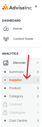
1. As a Platform-only customer you can view Price Change summaries under the relevant category. The example below is for a Supplier Price Change summary. This can be found under Discover>Supplier on the left-hand menu. The below logic is also applicable on Discover > Product, Discover > Category and Discover > Cost Centre for the relevant measures.
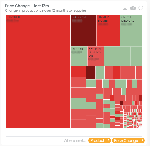
2. The summary table presents the Price Change in product prices over 12 months by Supplier.
3. After viewing the price change information in Supplier, you can then move on to the Product, Category and Cost Centre pages to explore Spend, Opportunity, Stats and Price Trends.
Step-by-Step Guide - Platform Plus page
1. Under Analyse on the left-hand menu, select 'Price Change'. Platform-only customers will have this page greyed out on their views.

2. From here you can select the Group or Organisation you would like to analyse. The total price change can be viewed by a number of dimensions by using the dropdown.
Red tiles represent an overall increase in prices
Green represents an overall decrease in prices.
The larger the square the bigger the impact
The larger the green square, the higher the confidence and larger the decrease in price. Similarly, with the red squares- the darker the red the higher the impact and the higher the price increase is.
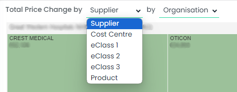
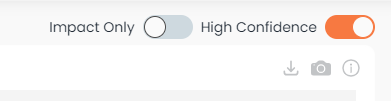
3. At the top right of the tile there is the option of viewing impact only and high confidence only.
Impact only - Clicking Impact Only will present variance inflation type data.
High Confidence - will present variance confidence range data.
Summary of overall position is available above the treechart which will show you the results based on your current selections. This will include what the cost pressure/benefit is and what % of your spend this equates to.
5. There is a table with additional details at the bottom of the page showing the backing data to the treegraph. It includes the following information:
- Trust Name
- Supplier name- mapped
- Current 12m Spend
- Previous 12m Spend
- Total Variance
- % Variance
- # Of Products
Notes And Tips
- Red squares represent Cost Pressure. The darker the red, the larger the impact.
- Green Squares represent Cost Benefit.
If you have any questions, please don’t hesitate to get in touch at support@adviseinc.co.uk or phone us on 0207 112 9222.
Was this article helpful?
That’s Great!
Thank you for your feedback
Sorry! We couldn't be helpful
Thank you for your feedback
Feedback sent
We appreciate your effort and will try to fix the article