How to create a custom bar chart
Modified on Tue, 10 Sep, 2024 at 4:33 PM
TABLE OF CONTENTS
Introduction
In this guide, we will take you through how to produce a customised bar chart, including stacked bar charts, within Platform.
Quick Guide
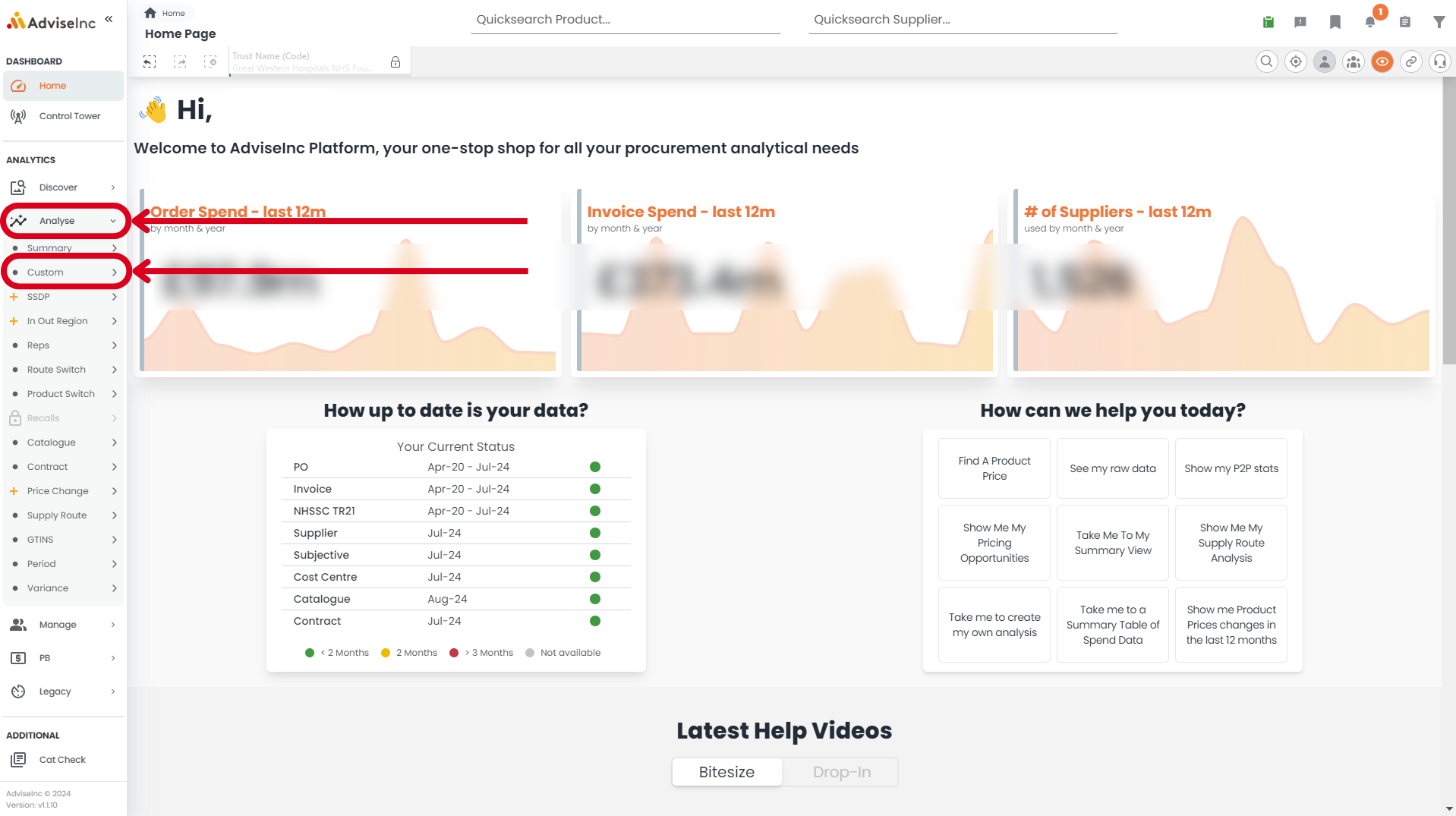
- Navigate to Analyse > Custom
- Add your required dimensions and Measures
- Select your visualision type from the icons on the top left of the analysis area
- To create a stacked bar chart select the 'Vizlib Bar Chart 2 Dim' icon, adding 2 dimensions and a measure
- Right-click in the Analytics search bar to utilise some of the additional features including horizontal or vertical stack, 100% stack and sort orders.
Step-by-Step Guide
1. Navigate to Analyse > Custom on the left-hand menu bar
2. Add your required dimensions and measures from the left-hand side of the custom analysis area. You can use the 'Analytic Search' bar to find measures and dimensions, if you cannot find them in the list
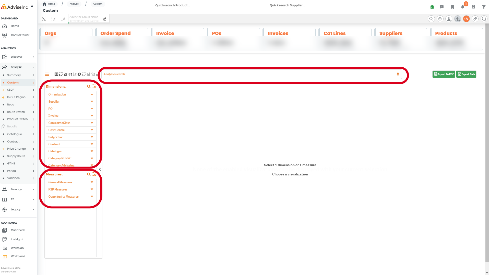
3. Select your visualision type from the icons on the top left of the analysis area. From left to right in the screenshot below these are:
a) Table - Create a standard table with as many measures and dimensions as you need
b) Pivot Table - Create a pivot table with as many measures and dimensions as you need
c) Combo chart - Create a chart with a single dimension and multiple measures all plotted on one axis
d ) KPI - Create a KPI with one or more measures only
e) Scatter chart- create a scatter chart with one dimension and two or three measures
f) Pie chart - Create a pie chart with one dimension and one or two measures
g) Vizlib pivot table - Create a pivot table with as many measures and dimensions as you need
h) Vizlib Bar Chart -Create a bar chart with one dimension and multiple measures, showing the bars side by side.
i) Vizlib Combi Chart - Create a line chart with one dimension and multiple measures
j) Vizlib Bar Chart 2 Dim - Create a stacked bar chart with one measure and 2 dimensions either horizontally or vertically stacked.

4. Once you have selected your desired visualisation, for example 'Vizlib Bar Chart 2 Dim', you can right-click in the 'Analytics search' bar to further customise the chart. Below are some example of the customisation available within the 'Vizlib Bar Chart 2 Dim' charts.
Show values on the chart - Right click > Vizlib Bar Chart 2 Dim > Show all values
Change between horizontal and vertical chart - Right click > Vizlib Bar Chart 2 Dim > Vertical/HorizontalCreate a 100% stack graph - Right click > Vizlib Bar Chart 2 Dim > Display Type > Stack100%bar
Show or Hide Axis or legends - Right click > Vizlib Bar Chart 2 Dim > Axis & Legends
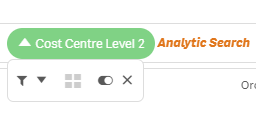
5. Hover over your selected measures and dimensions in the analytic search bar to either filter by them, order, hide, or remove them.
Notes And Tips
- Right click in the Analytic Search bar to see more options including adding and removing axis, labels and reordering dimensions/measures.
- View how to create a pivot table here or a standard table here.
If you have any questions, please don’t hesitate to get in touch at support@adviseinc.co.uk or phone us on 0207 112 9222.
Was this article helpful?
That’s Great!
Thank you for your feedback
Sorry! We couldn't be helpful
Thank you for your feedback
Feedback sent
We appreciate your effort and will try to fix the article